(Company Logo)
At first I opened up a new document with a width of six inches. To begin designing I started with the text of my logo. I typed it out then changed the text font to Lucida Handwriting, as well as made the font size larger. I wanted to adjust the width of space between the letters and space out the name a little so I used the horizontal and vertical scales on the top toolbar to do so. I then wanted to approach my theme colors I’d be using throughout the design. I decided to use a purple for the title that I created by right clicking the opened swatch panel and creating a new one. After doing so, I then realized the color was hardly noticeable due to how thin the text was. Therefore, I decided to thicken the width of my text by going to the stroke panel and adjusting the weight to 1 pt. To add a design I went ahead and created a star by choosing the polygon tool and clicking once on the workspace. A window pops up and I changed the sides to 5 and the percentage to 50. By doing so it created a star. I went to color and chose a yellow fill for the inside of the star and then copied the star and pasted matching ones to put beside each other. I wanted to add something to the stars so I chose the drop shadow button on the top tool bar and it added some depth to them. Most logos I have seen have a little design or saying to go with the title of their company, so I decided to write, “Traditional entertainment” underneath my company logo to help describe the overall definition of what my company represents. I kept the text in the Lucida family of fonts but chose Lucida Calligraphy for the small writing, as well as changed the skew percentage to -8 so that the font didn’t have to look italicized. My overall look of my logo is to catch the eye with the colors I used and to not over-crowd my viewer by using a simple, clean looking logo that gets the point across.
(Company Ad Explanation)
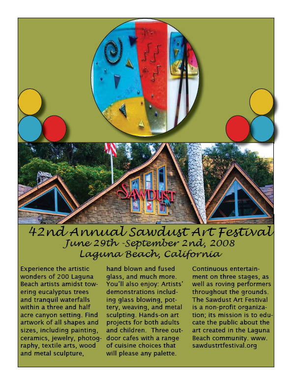
For a company ad I feel it is very important to catch the reader's eye. The more people that see your product, the more your product will get itself out there and sell. For the Sawdust project I used four colors as the overall color scheme; green, yellow, blue, and red. These were the four colors I noticed reoccurring on their website so I decided to make a theme of them. Some of the artwork that they had pictures of on the website I decided to save and paste into my design shapes, contorting the pictures to fit within the shapes I created. If you are representing a company, product, or something of the sort, the ad needs to appear organized, clean, and easily readable. I wanted “42nd Annual Sawdust Art Festival, June 29th- September 2nd, 2008 Laguna Beach, California” to be the largest text font so that the first thing the person will notice is what exactly the ad is about, when, and where it is held. The more descriptive text I left in small text, aligned in columns to give it more of a formal, clean appearance. I created circles with my circle tool and then copy and pasted multiple circles of the same size so I could fill them with the themed colors to group the overall look of the ad together in one piece. What I liked most about the final results of my project was the picture of the Sawdust building being the focal point, drawing the reader’s eyes directly to the center of the ad which is the title of the festival, ‘Sawdust’.
(Calendar)
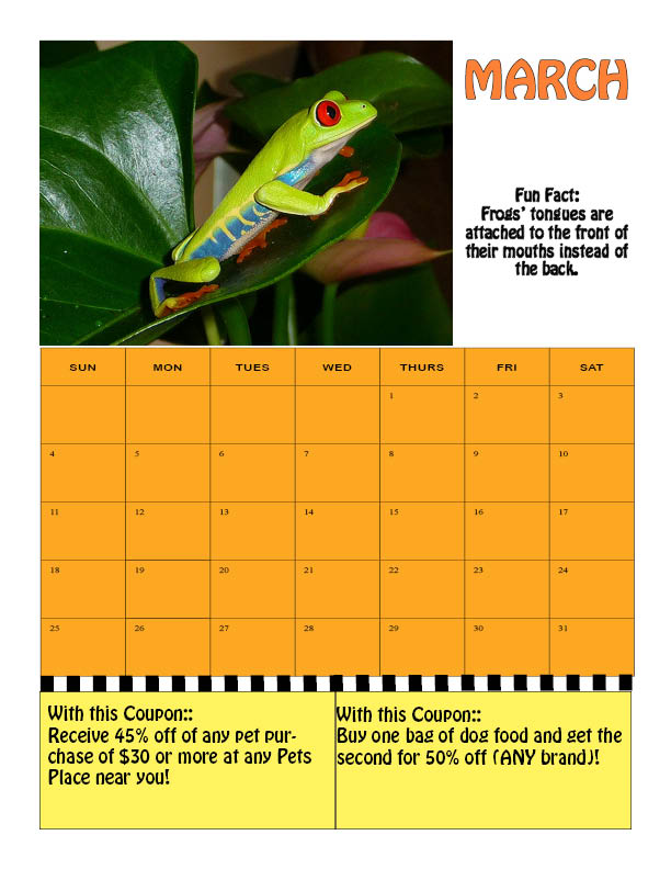
For my third project I started with constructing the calendar first. In order to do so, I went to Excel and created a sheet of the days of the week, as well as the days of the month. Once I was finished with this I copied and pasted the layout into InDesign and began working on my creative design. First I went to the web and found three different images on the web that would be suitable for the theme of the calendar. I used the control and alt buttons on my computer to resize the images to fit the pages as I planned. Then, I highlighted the calendar’s dates to fill in a color that would match the theme for each different month. After I did the color I used the eyedropper tool to create a darker image of the color for the Month’s name. I also added an edging around the text of the months so that the name would appear to stick out more so than the rest of the text. I went ahead and found my fun facts online and added text boxes to each calendar in order to apply the facts where I wanted them. I changed the text font to the same font I used for the coupons and month title that way there is an overall design of text. I didn’t want to clutter the eye of the viewer so I made sure to stick with certain colors that went well with each month’s picture. I wanted the coupons to appear as though you could cut them off with scissors, so I used the line tool to draw a line between the calendar and the coupons at the bottom of the page. Then, I added a lot of weight to help thicken the “line to cut”, and then decided to change the type to ‘dashed’ so that it appears you can cut along it.